Ora Carbon.

Consumer focused carbon credit trading app.

A pioneering startup with a mission to allow access to the Voluntary Carbon Market (VCM) — a market that has traditionally been out of reach for everyday consumers.

Design Lead
Product Design
Product Architecture
Website Design

Overview

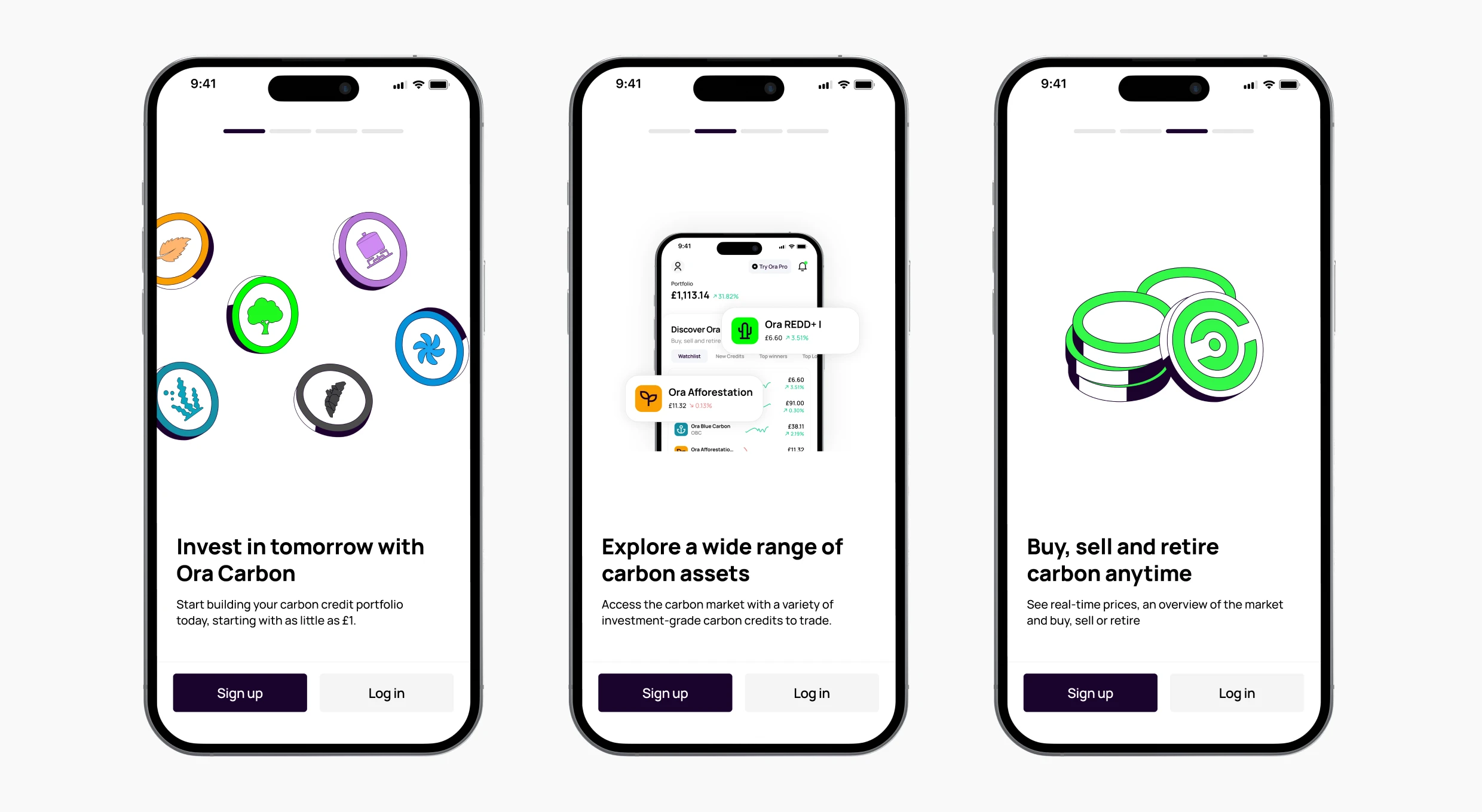
Ora Carbon was built to make carbon credits accessible to everyday consumers through a native mobile trading experience. The wider goal was to open up th market while keeping the product approachable, transparent, and safe to use.

Leading product design across Ora Carbon, the focus was twofold: empowering users to trade and manage a carbon credit portfolio, while also educating users on a market and projects that are unfamiliar to most people. This meant solving for onboarding friction, regulatory style verification, funding, and absolute clarity in portfolio value so users never misread what they own or what it is worth.

Concept

Ora Carbon gives consumers a simple way to buy and sell carbon credits, alongside the ability to retire credits to offset emissions. The product needed to balance two different mindsets. Trading requires speed and confidence. Offsetting requires understanding, trust, and clear intent.
Because carbon credits are not a mainstream consumer product, the experience also had to carry the learning. What a credit is, why projects differ, what “retiring” means, and what ownership looks like in practice.

Onboarding

The onboarding requirement was heavy. Users needed to understand what carbon credit trading is, complete KYC so age eligibility was verified, and deposit funds before they could actually buy credits. Stacking all of that upfront creates drop off risk, especially in a platform most users are unfamiliar with.
The idea was to prioritise understanding and momentum first, then introduced verification at the exact point it becomes essential. A short set of carousel screens explained how the platform works and set expectations early, then the product allowed users to explore and build trust before asking for anything high friction.

KYC 

KYC was intentionally moved into the buy flow. Verification only appears when a user is committed to purchasing, which reduces early friction while still keeping the platform safe and compliant at the moment it matters. Because parts of KYC happen outside the app, clear progress states and next steps were critical, and email and in app toast notifications were used to update users on status and bring them back into the flow at the right time.
Depositing funds could also be delayed until users were ready. That meant the product could earn trust first, then ask for commitment once the value was clear.

Portfolio clarity and
asset value

Because Ora involves money and investments, portfolio clarity was non negotiable. At no point could users confuse the value of an asset with the value of their holdings, or misread what their ownership means in real terms. The cost of misunderstanding here is catastrophic, even if the product is technically correct.
The key pattern was separating market price from portfolio value. The live price of an individual asset was kept inside the asset detail view, not scattered throughout the portfolio. In the portfolio, the focus was always on what the user actually owns and what that ownership is currently worth. Displaying the quantity held alongside the value in the user’s currency helped keep interpretation grounded, so the portfolio reads as “this is what you have”, not “this is what the market is doing”.
A further layer of complexity came from retirement. Not only could users buy and sell credits, they could also retire them, effectively offsetting emissions and burning the credit. That flow needed additional education to feel safe and intentional. In app tips, supporting screens, and longer form articles were used to build confidence, making it clear what retirement means, why someone might do it, and what changes once an asset is retired.

Post launch

results

5x

increase in stock price since IPO

780+

waitlist sign ups